Overview
Role: Brand designer
Project: Brand identity for GO, a concept outdoor gear label
Course: Brand Experience, Montreat College, Spring 2025
Tools: Figma, Adobe Illustrator
Gear Optimized (GO) is built on one idea: premium-level outdoor technology at a fraction of luxury prices. I took the brand from research and strategy through the name, logo, visual system, and the ads and mockups that put it to work.
Part one: Brand audit
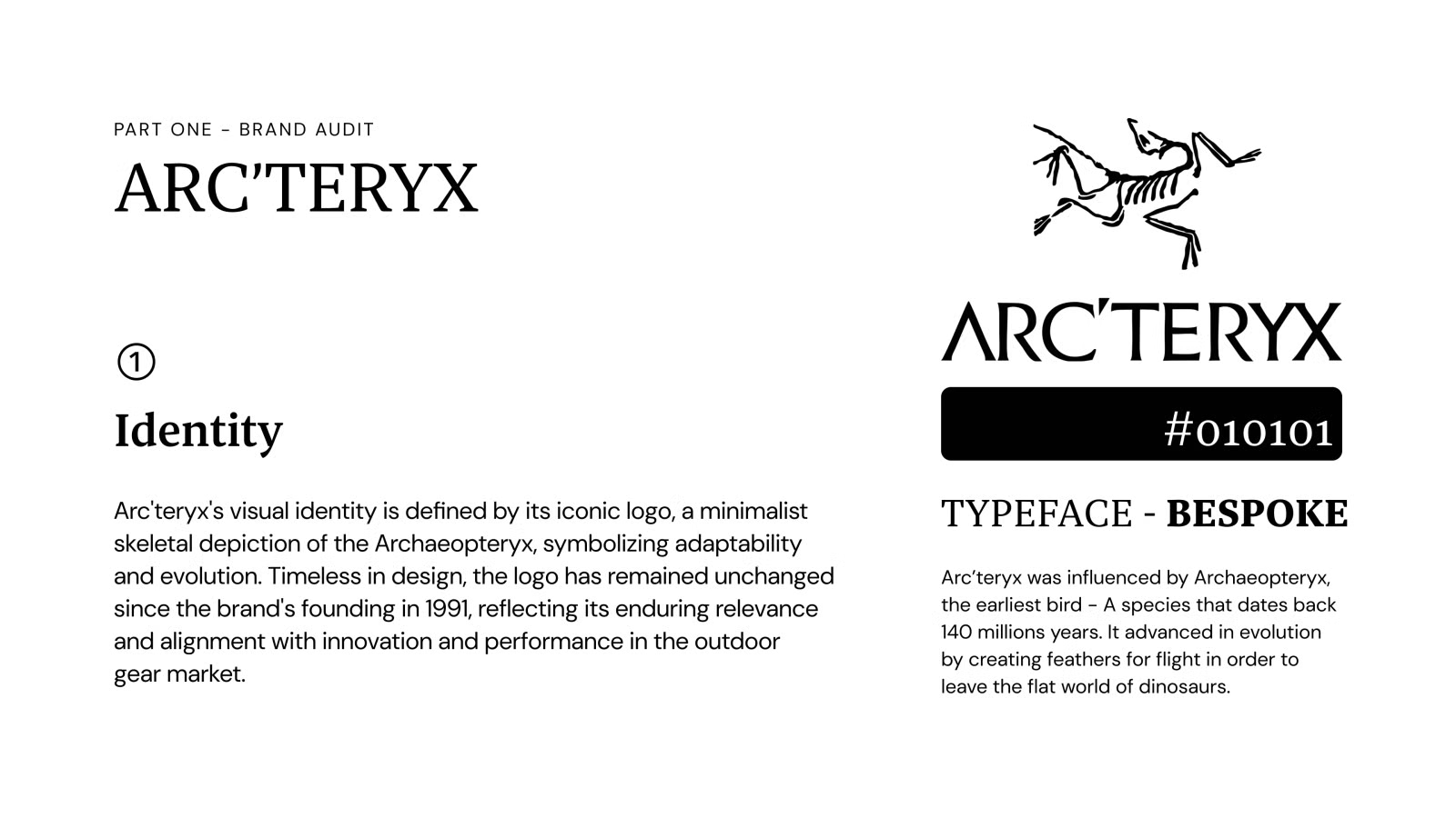
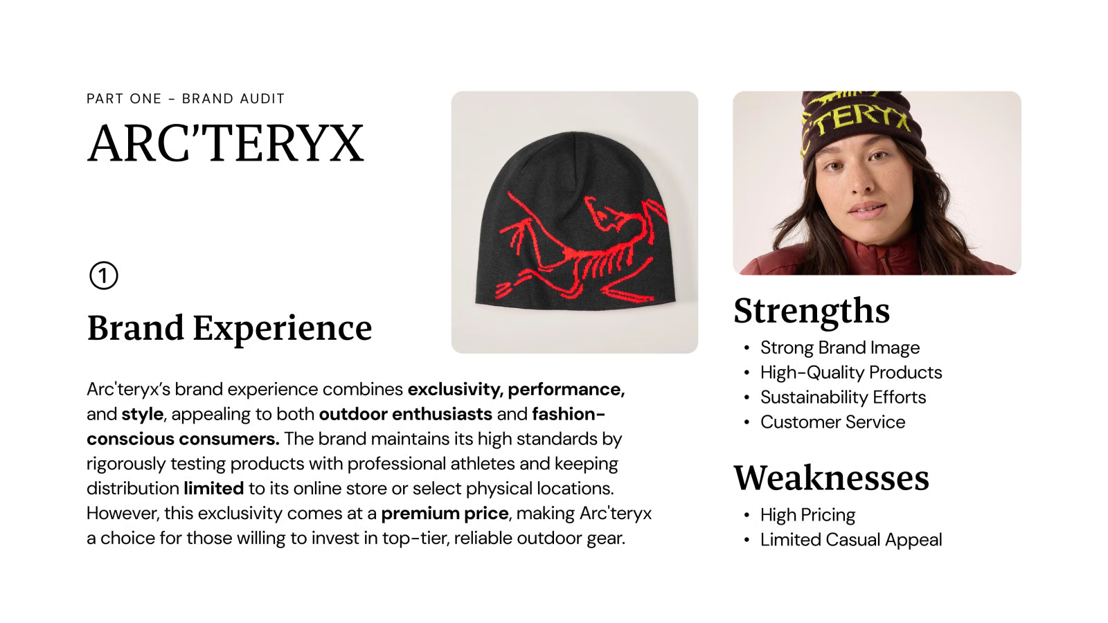
I started by studying Arc'teryx, the premium benchmark GO is positioned against. I looked at its identity, its messaging, and the experience it creates. It has a strong brand image and high-quality products, but a high price and limited casual appeal. That gap is where GO fits.
Part two: Brand strategy
GO offers high-performance outdoor gear with premium technology and versatile style at a fraction of the price of luxury competitors. Like Arc'teryx, it uses high-end technology and tests products with athletes. Unlike Arc'teryx, it is more affordable and widely available.
Tech geeks and casual adventurers are the audience. Luxury lovers and hardcore brand loyalists are not.
Mission and vision
Mission: To deliver innovative clothing technology to adventurers by prioritizing efficiency and functionality over branding, enhancing their journeys.
Vision: To equip every adventurer with innovative outdoor technology.
Brand values
- Innovation: We push outdoor technology forward to empower adventurers with better experiences.
- Transparency: We are committed to honest pricing, ethical practices, and clear communication, valuing functionality over branding.
- Community: We listen to and collaborate with adventurers and professional athletes, incorporating their feedback to refine our gear.
- Sustainability: We minimize our environmental impact with eco-friendly materials and responsible manufacturing.
- Passion: We live for the outdoors and inspire adventurers to make the most of their time in nature.
Brand personality
Archetypes: The Explorer, The Creator, The Everyman
Key traits: Free-spirited, passionate, reliable, honest
Voice: Confident, knowledgeable, and down-to-earth. Bold yet relatable, with innovation but without exclusivity. Clear, honest, and practical, focused on real value for outdoor enthusiasts.
Part three: Product strategy
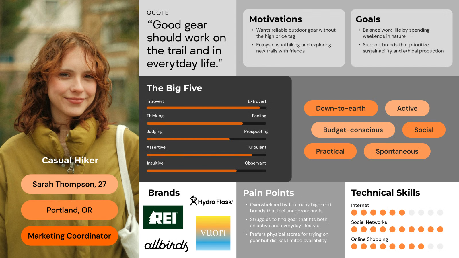
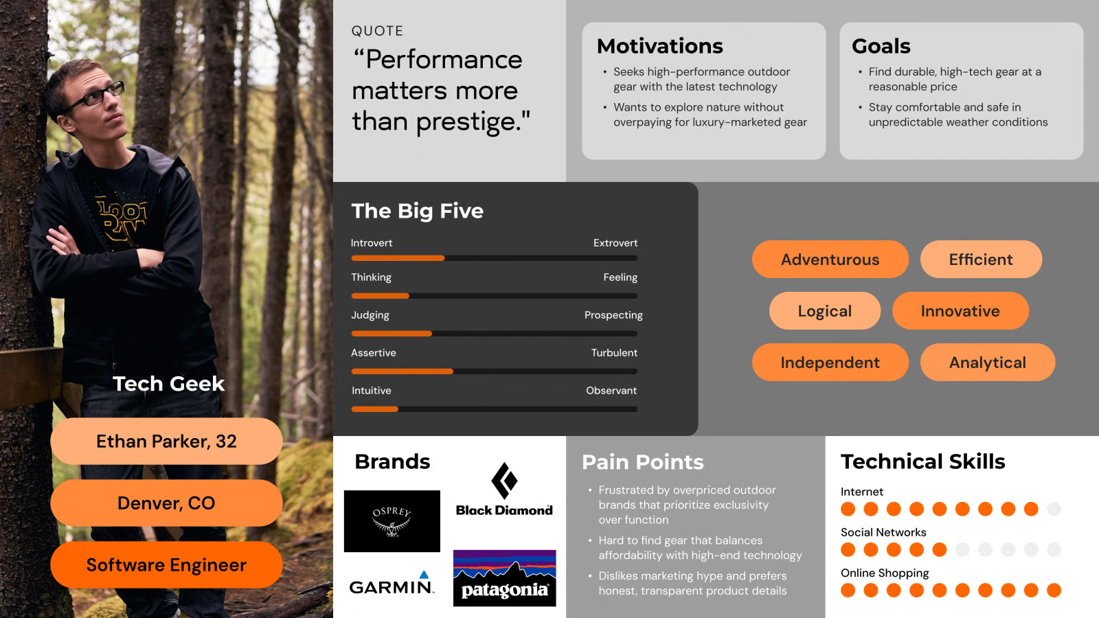
Two personas guided the work. Sarah Thompson is a casual hiker who wants gear that works on the trail and in everyday life. Ethan Parker is a tech geek who believes performance matters more than prestige.
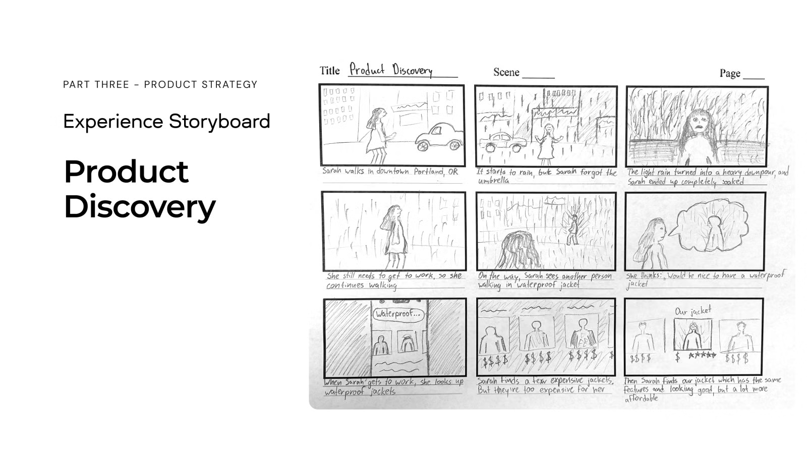
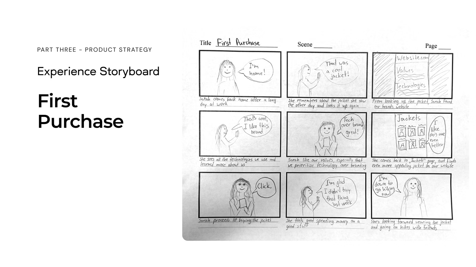
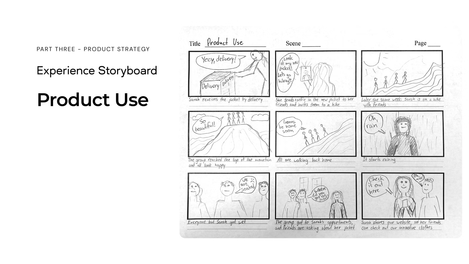
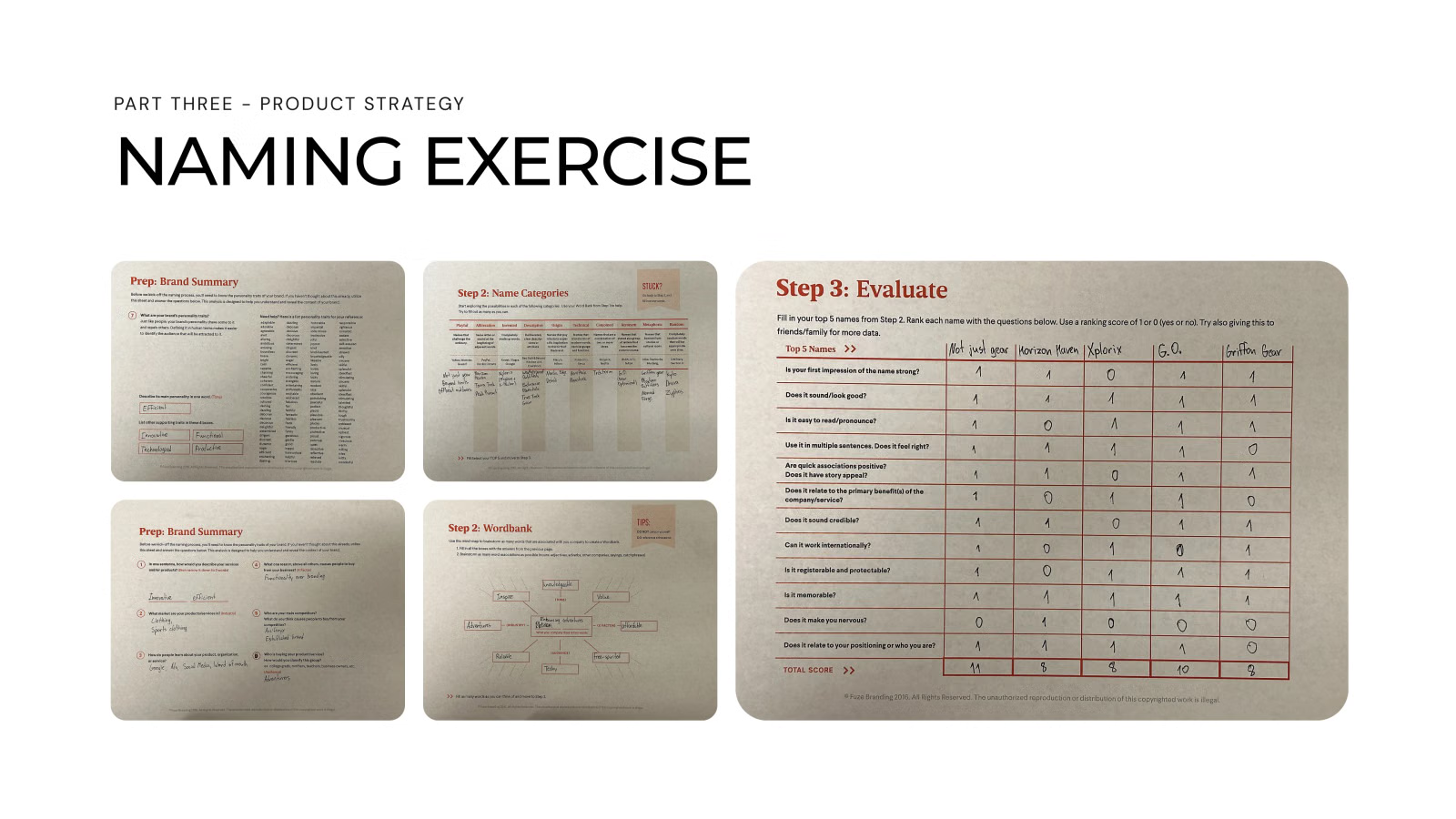
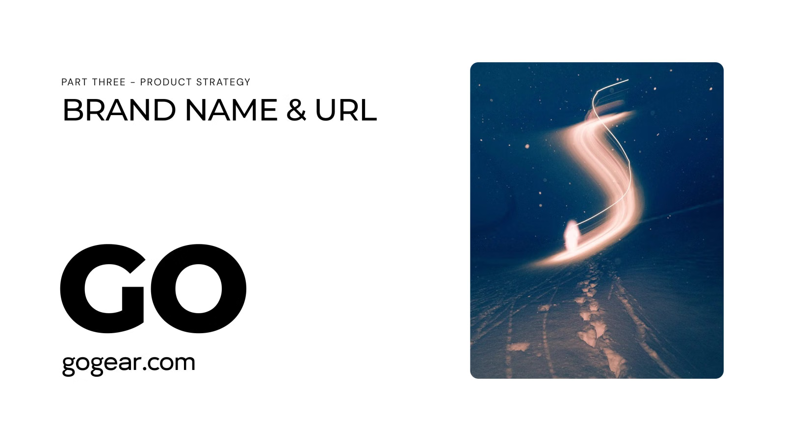
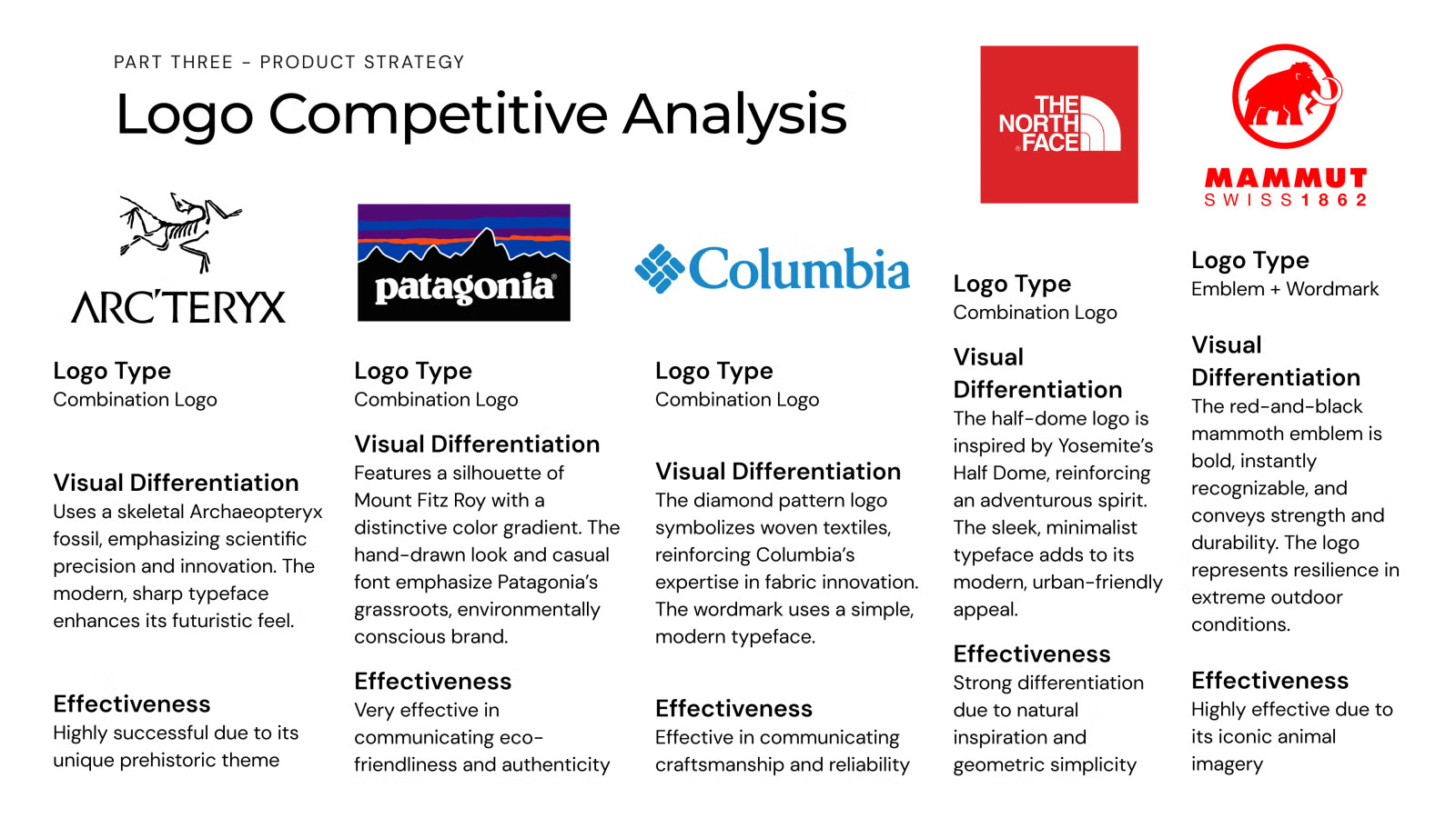
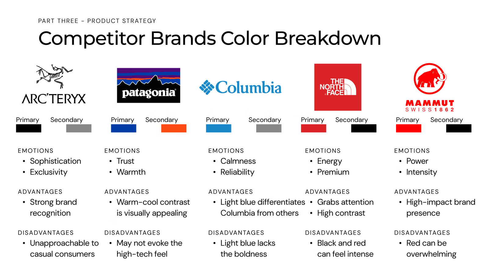
I sketched three experience storyboards (discovery, first purchase, and use), ran a naming exercise that landed on GO, and compared competitors' logos and colors to find where GO could stand out.
Part four: Identity creation
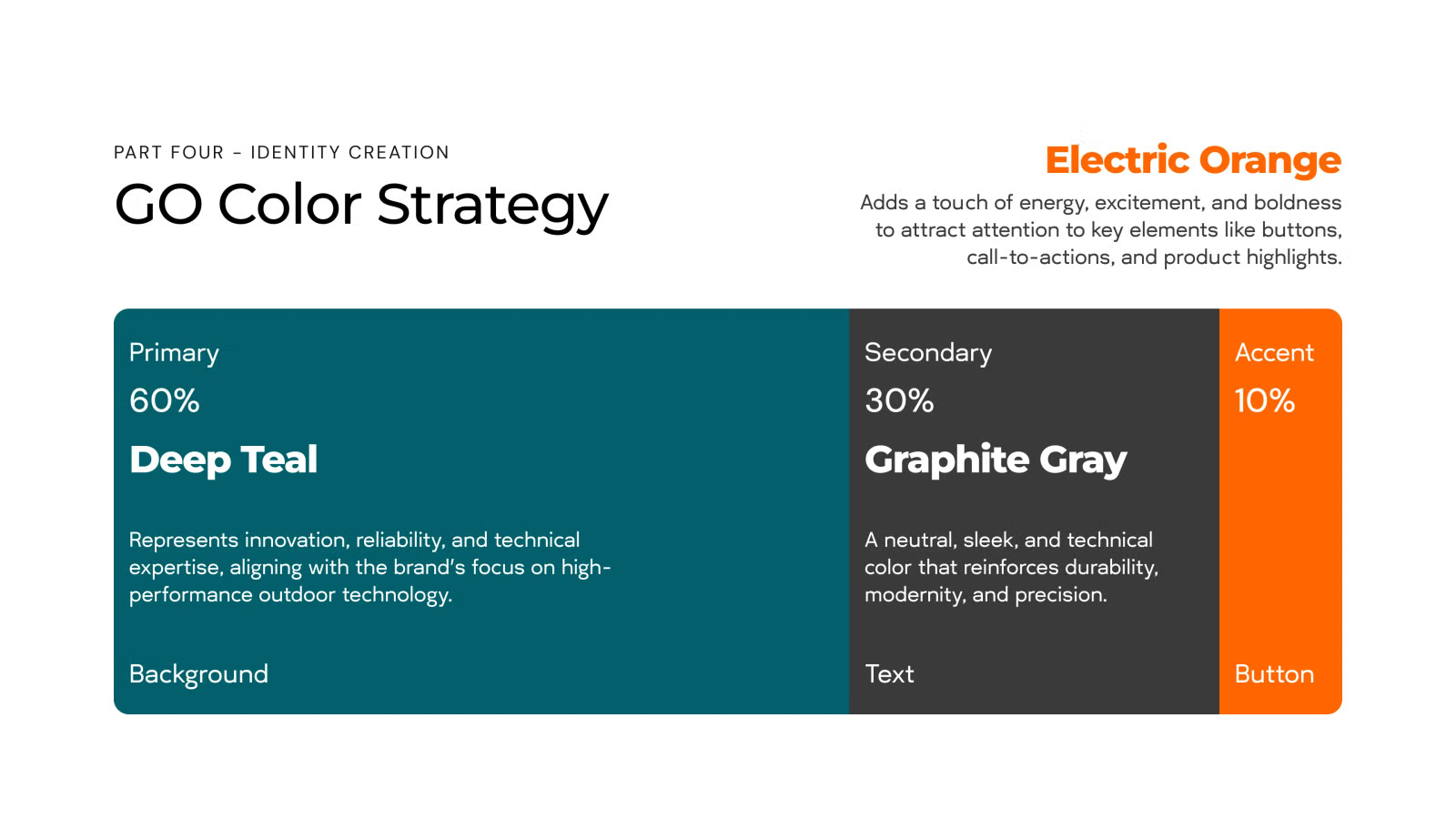
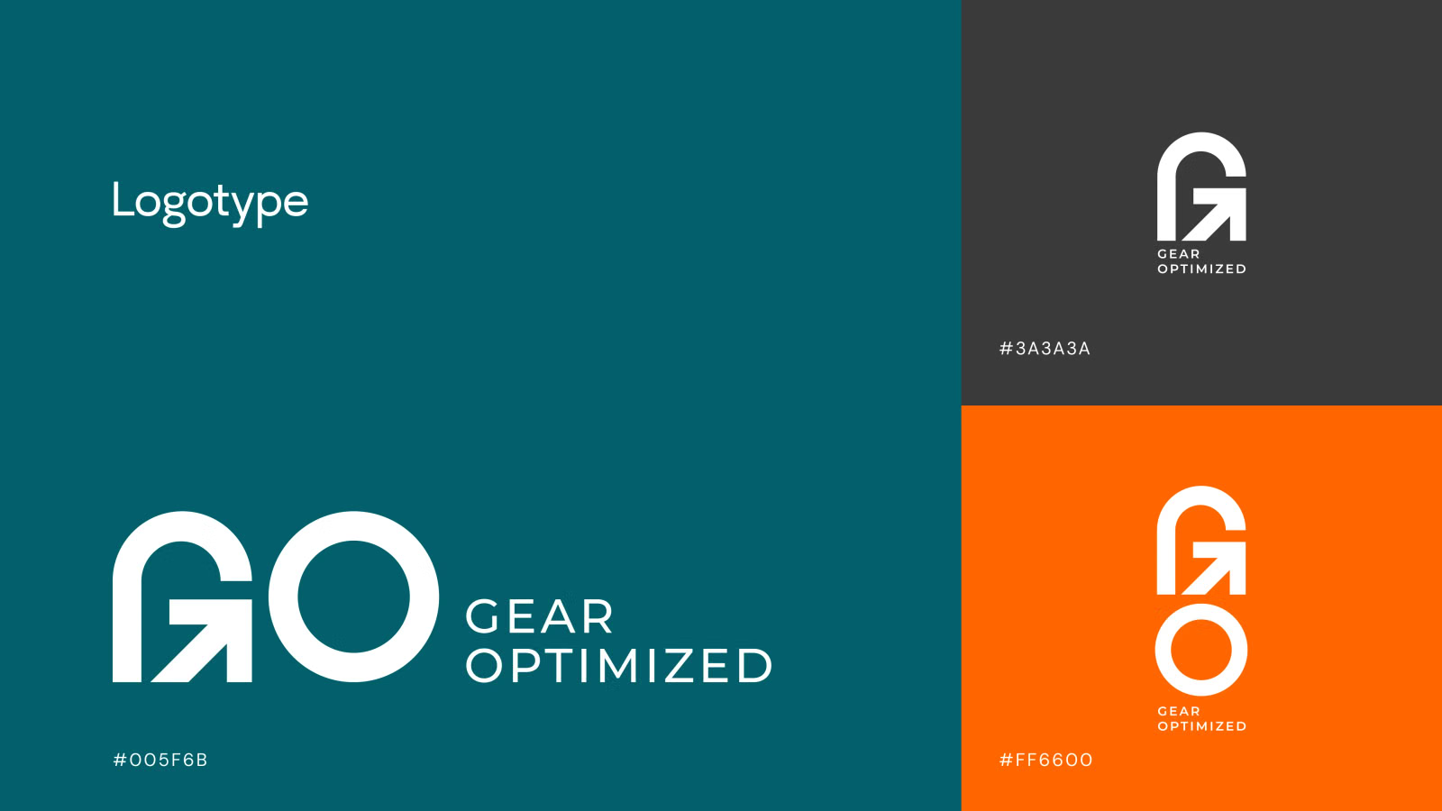
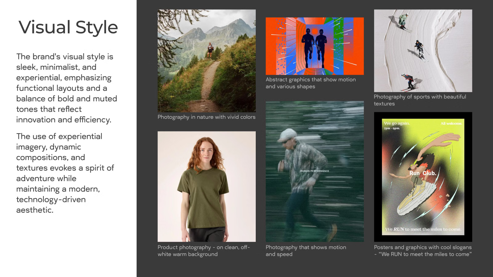
The color strategy follows a 60/30/10 split: Deep Teal for innovation and reliability, Graphite Gray for durability, and Electric Orange for energy on buttons and calls to action.
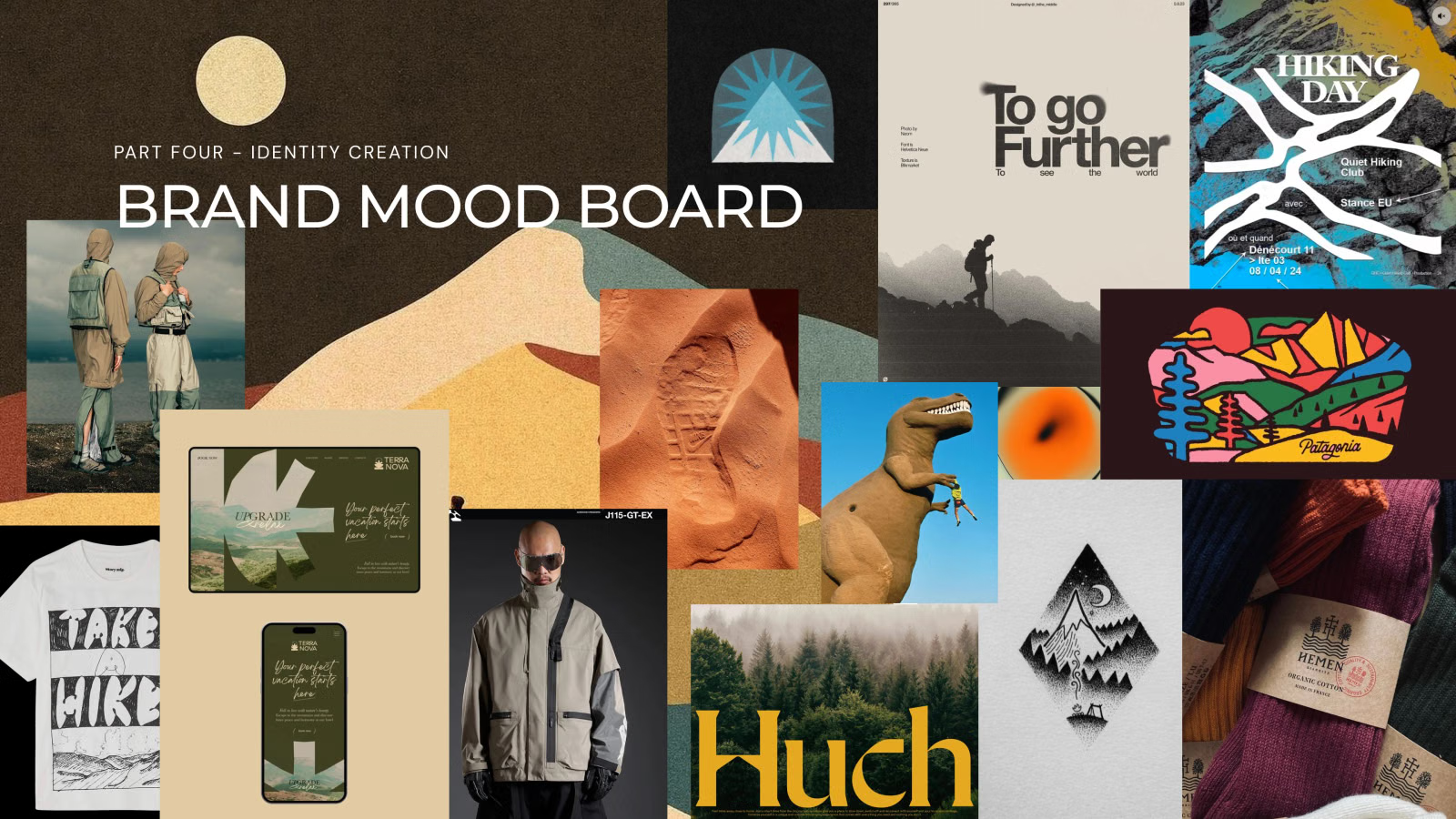
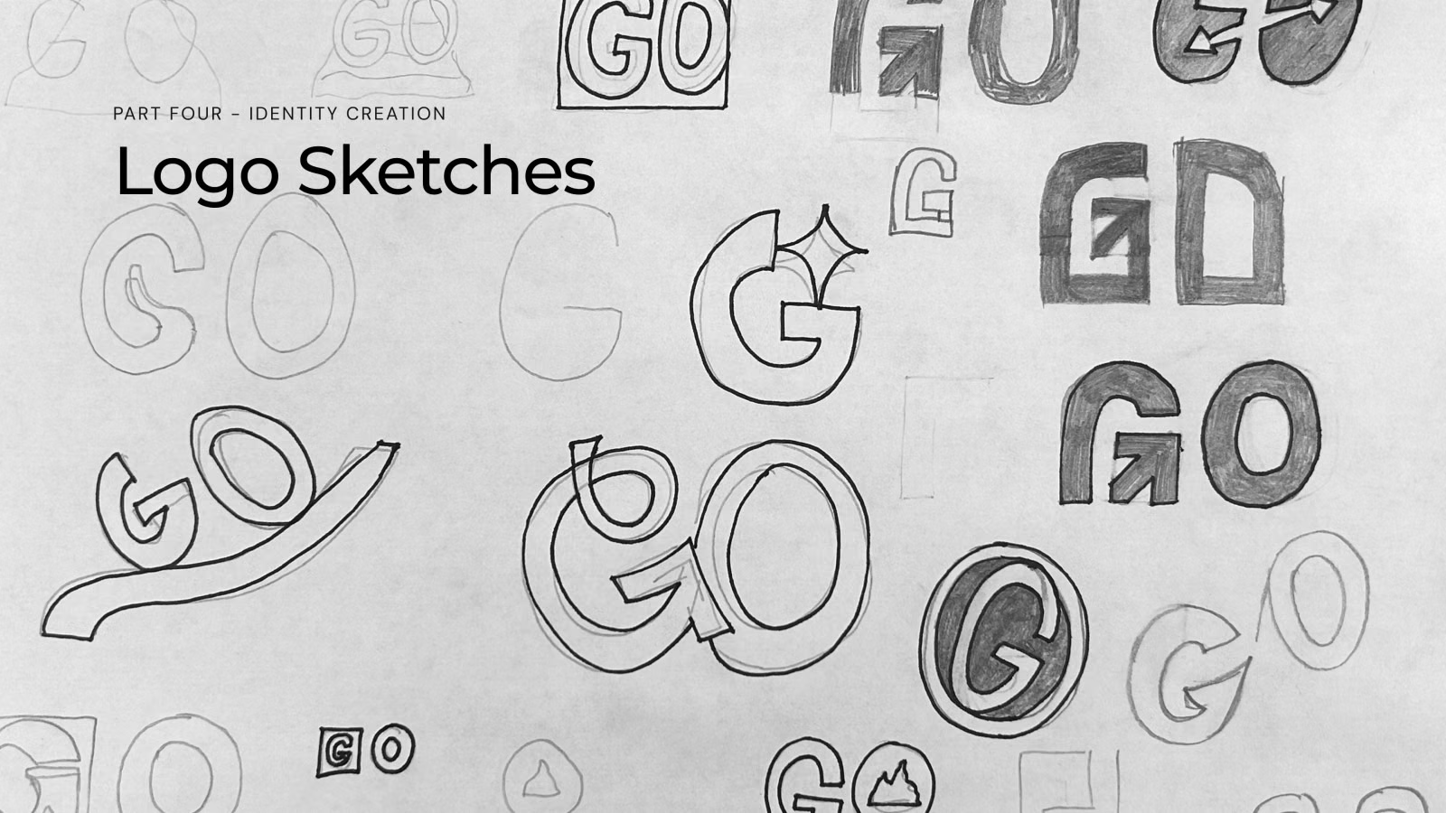
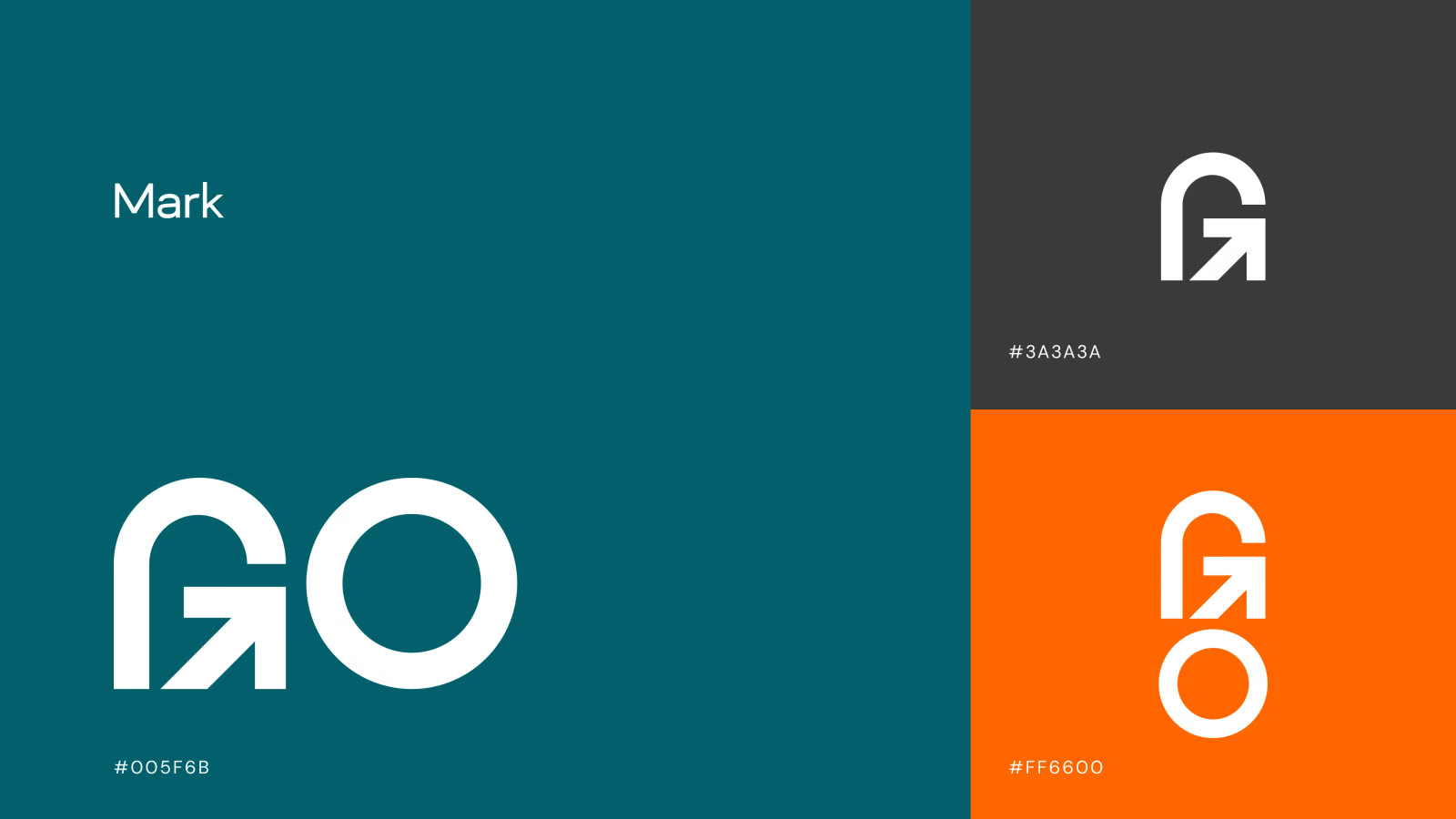
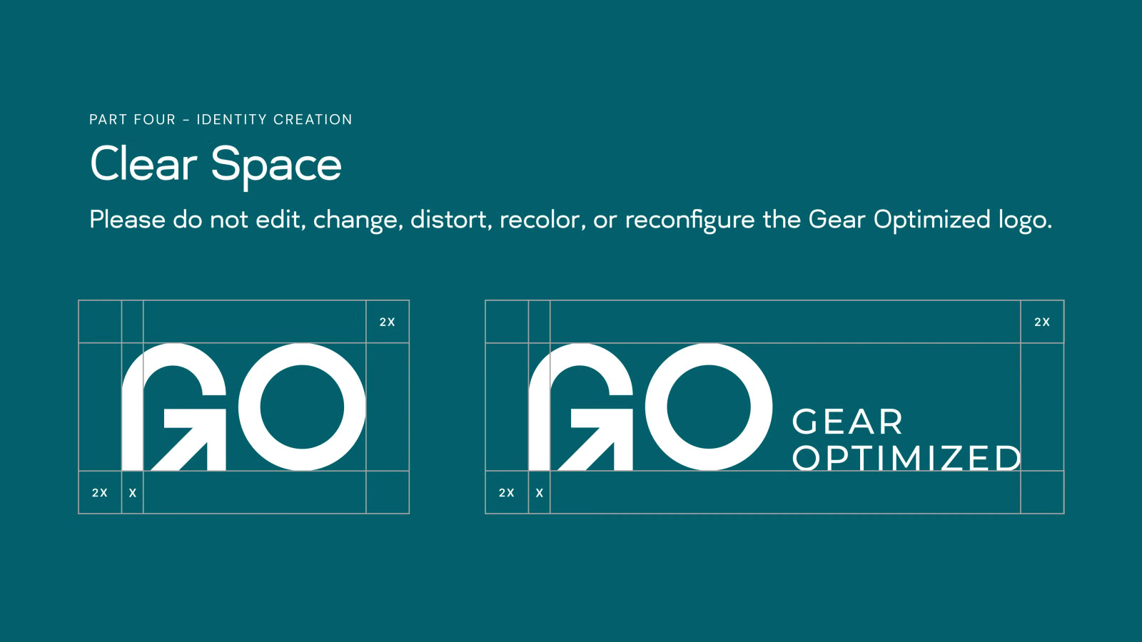
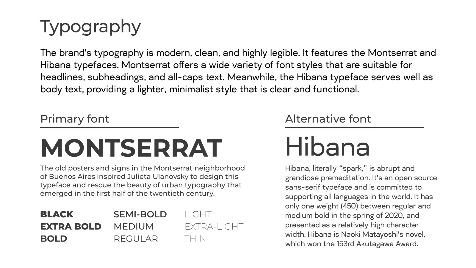
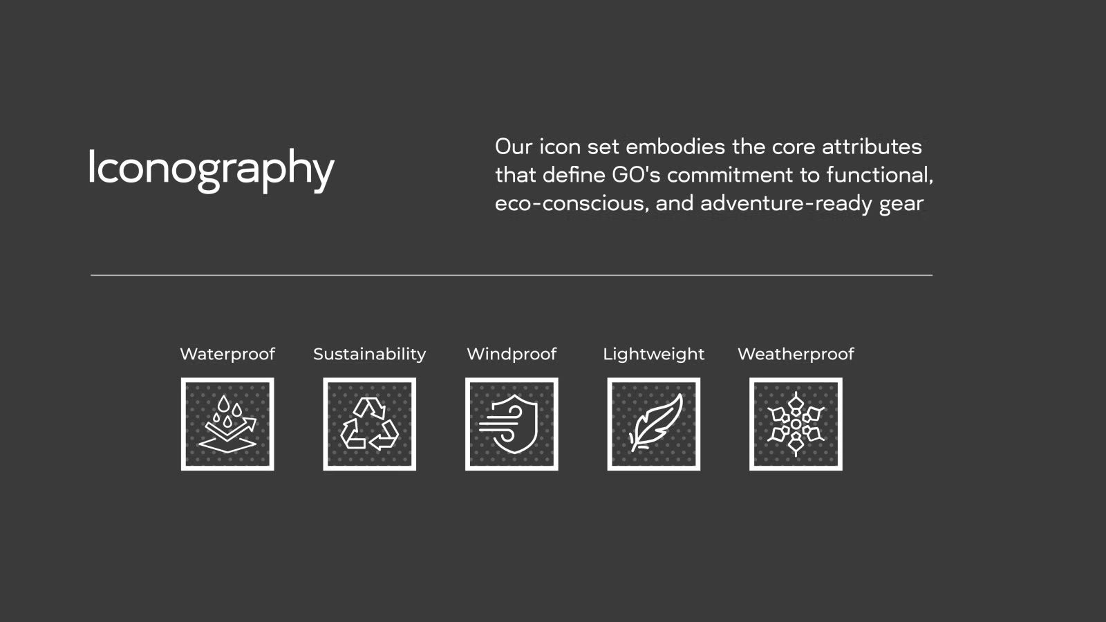
The mark joins a G and an O, with an arrow built into the G. Montserrat carries headlines and Hibana handles body text. A five-icon set covers waterproof, sustainable, windproof, lightweight, and weatherproof gear.
Part five: Brand expression
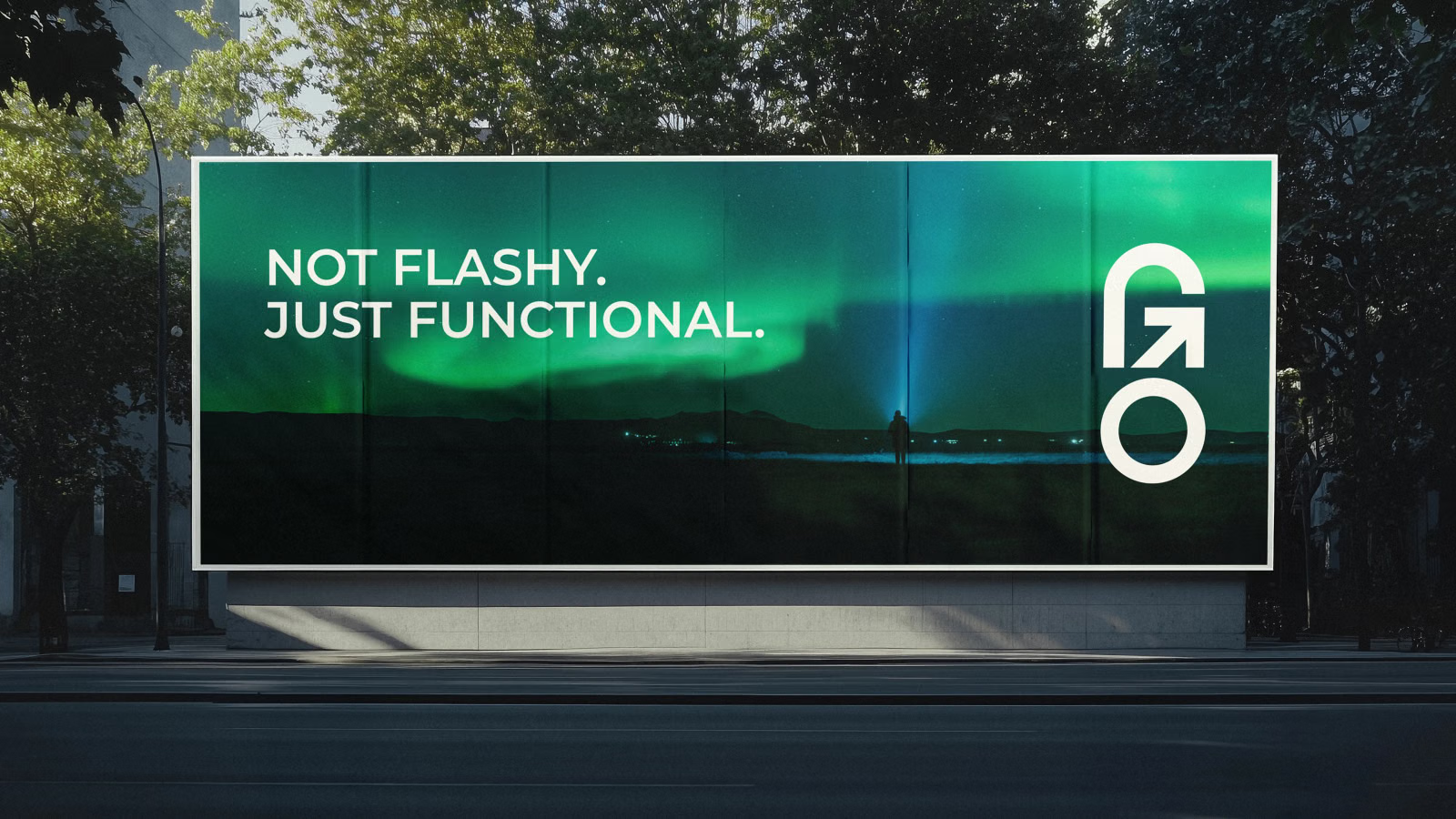
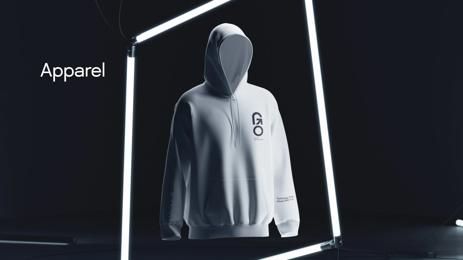
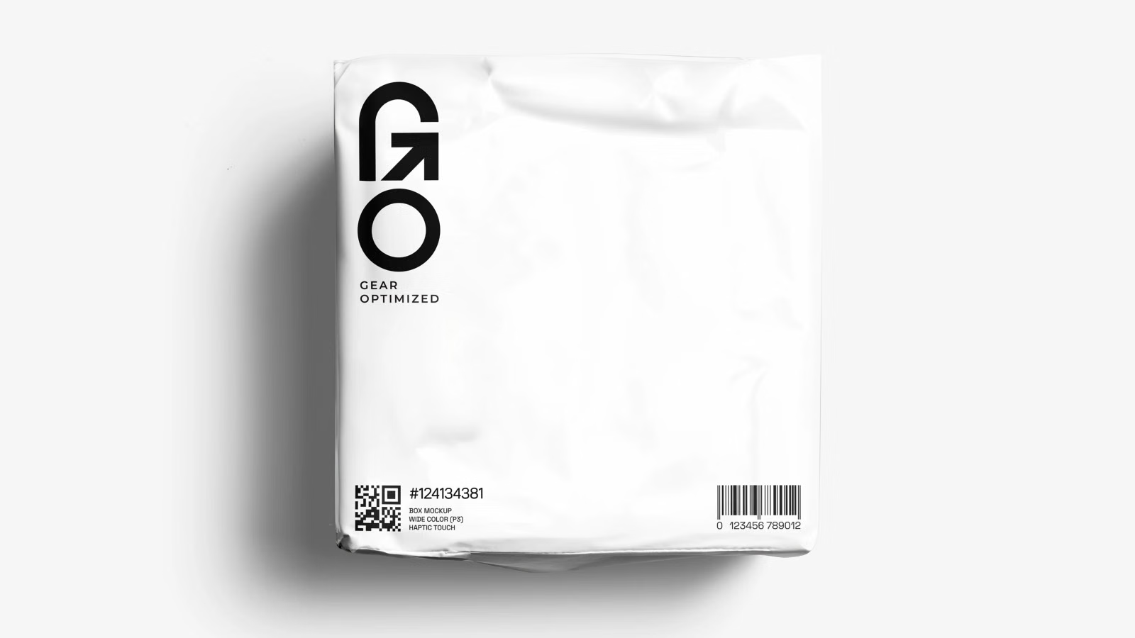
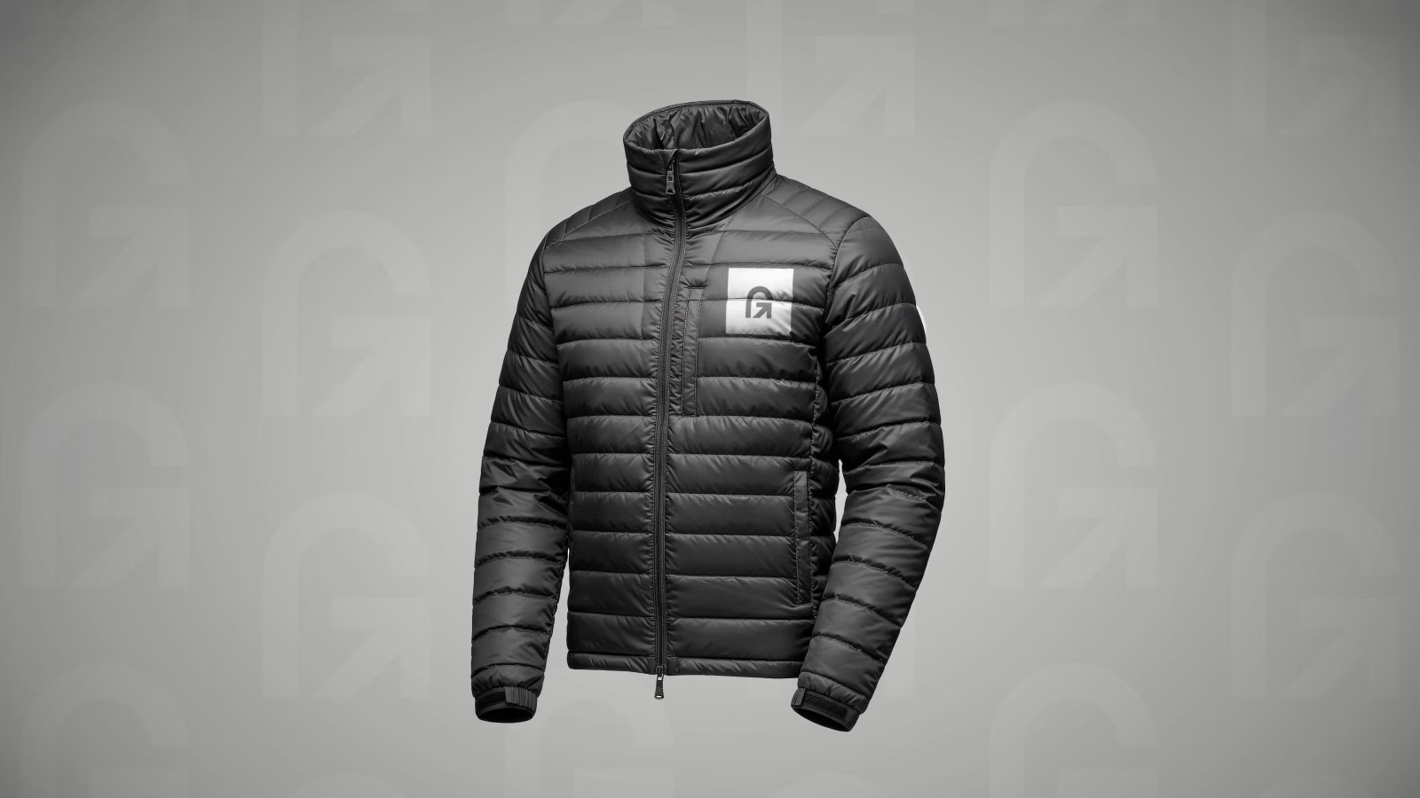
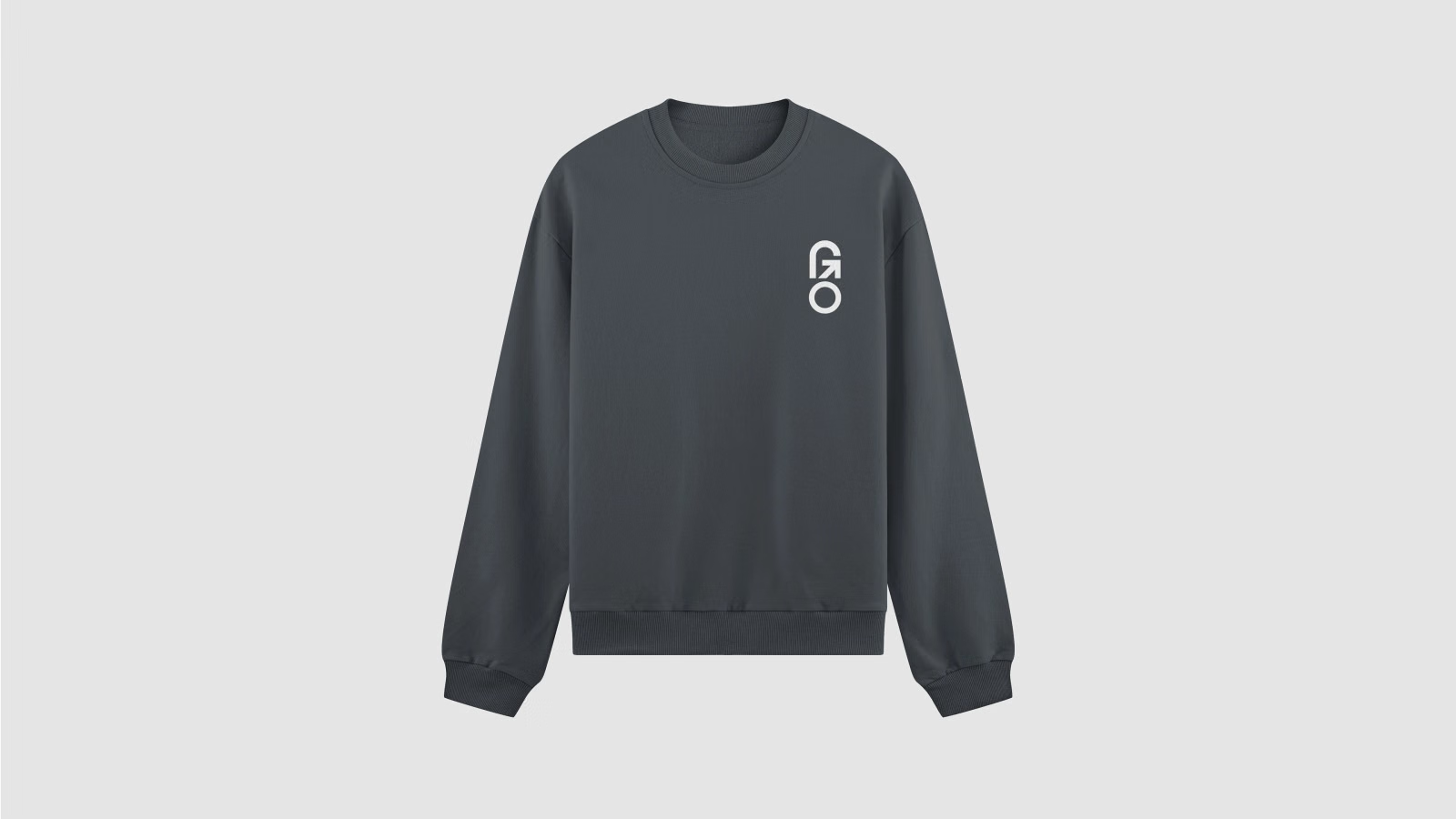
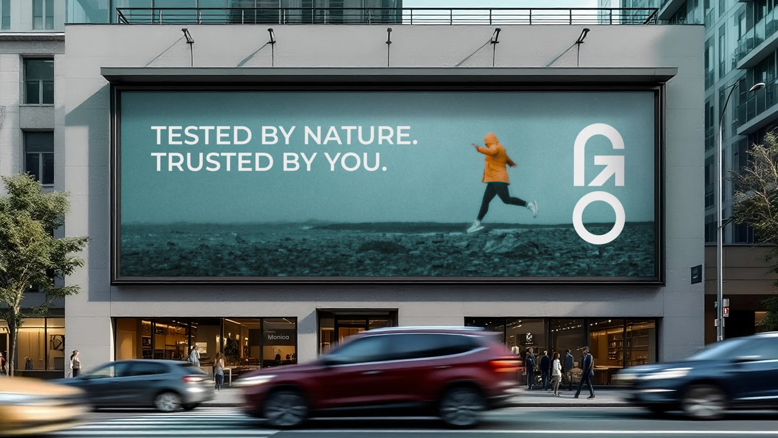
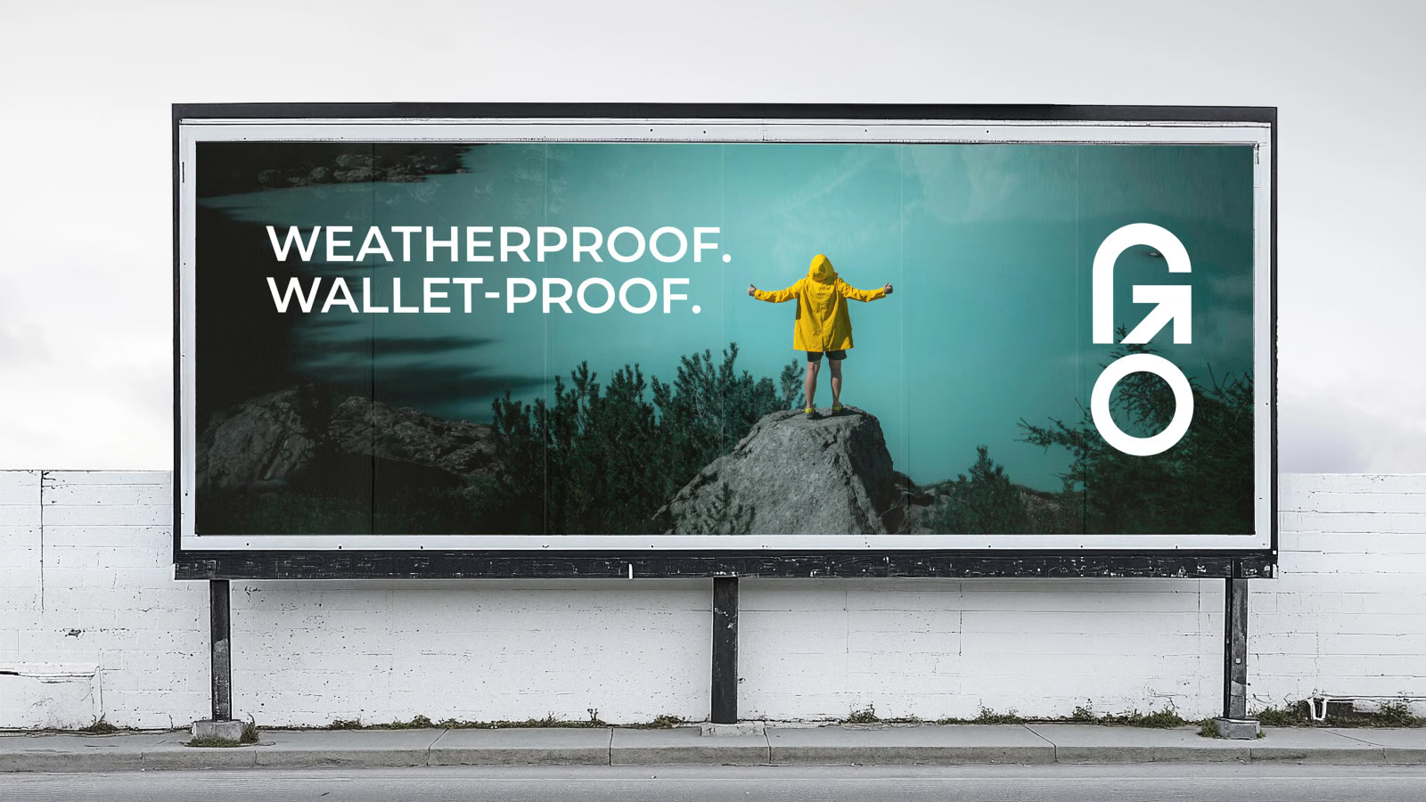
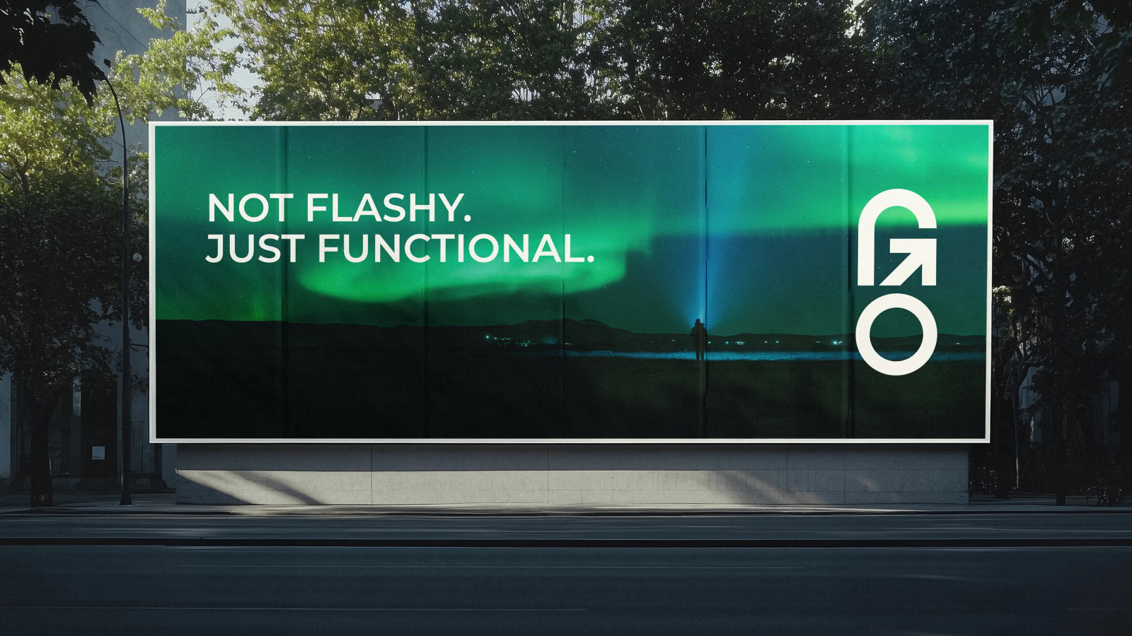
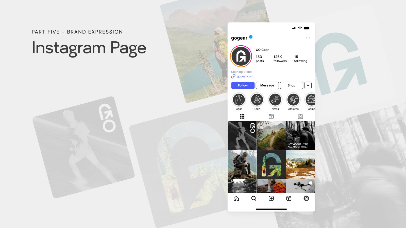
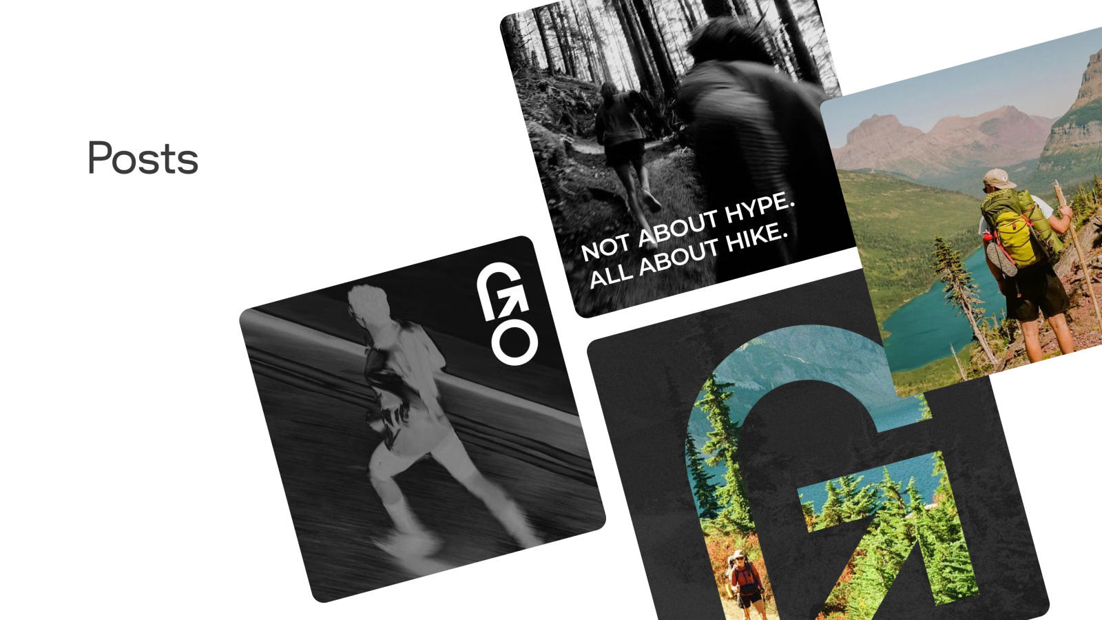
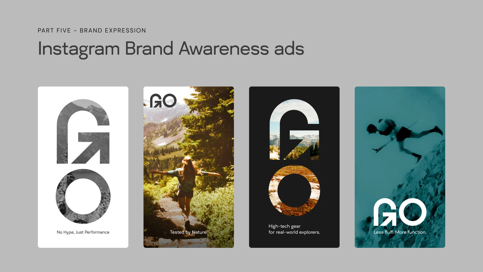
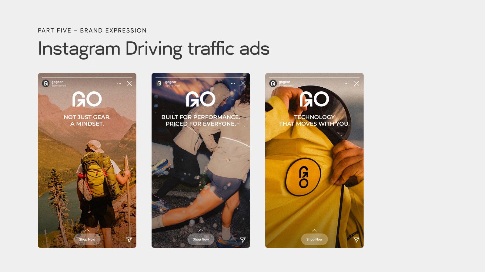
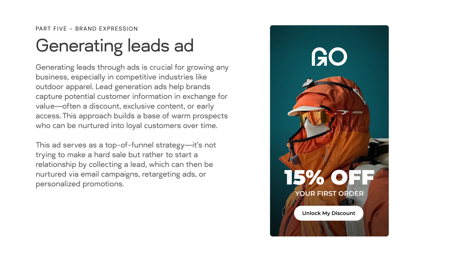
With the system in place, I applied it to apparel, packaging, billboards, and an Instagram presence. The ads follow the marketing funnel, from brand awareness to driving traffic to lead generation, with lines like "Not flashy. Just functional."
Outcome
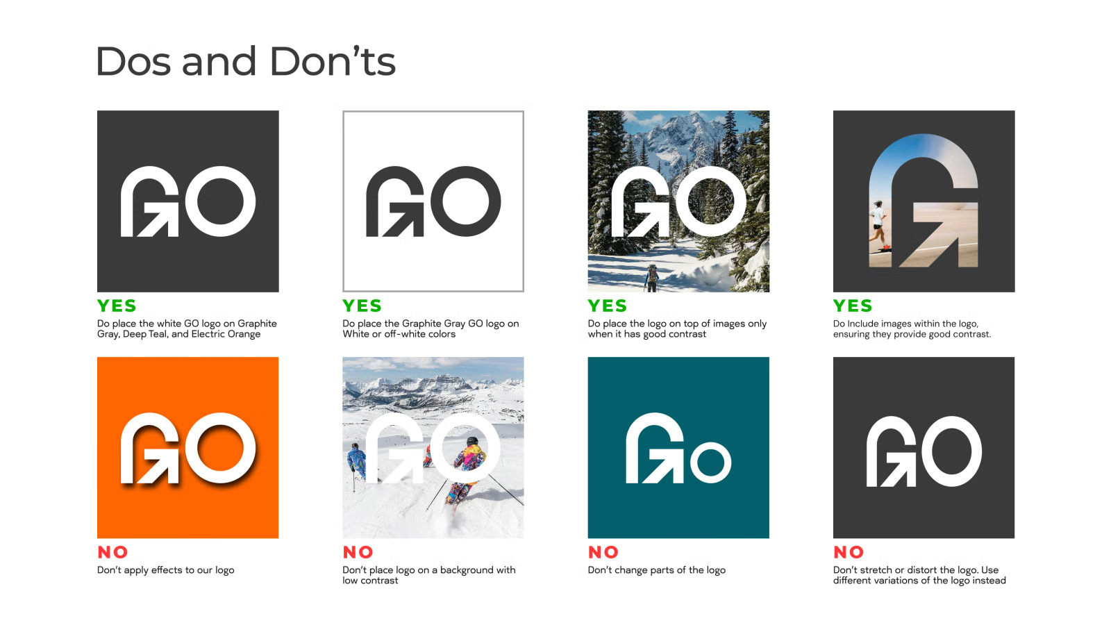
GO now has a complete, consistent identity: strategy, name, logo, color and type, an icon set, applied mockups, and social ads. The full brand guidelines document how the mark, color, type, and imagery are used across all of it.